Independent family lettings agent
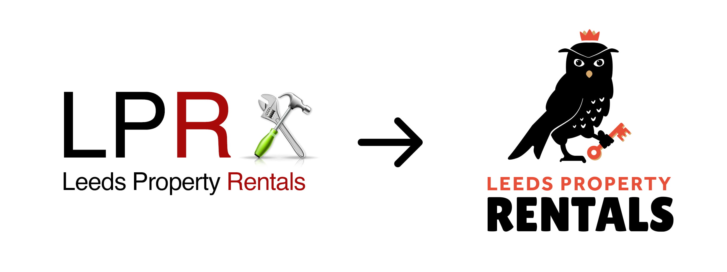
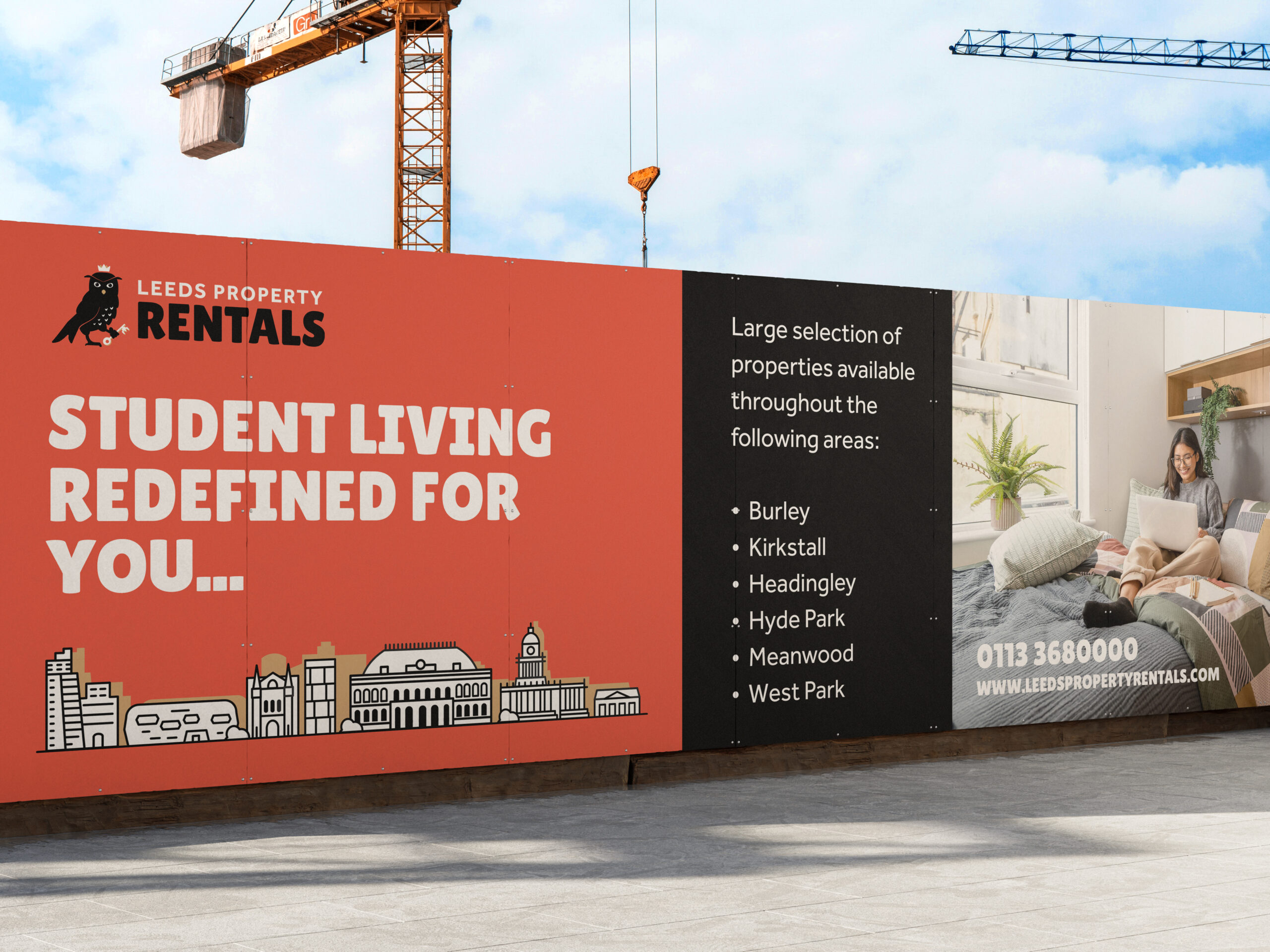
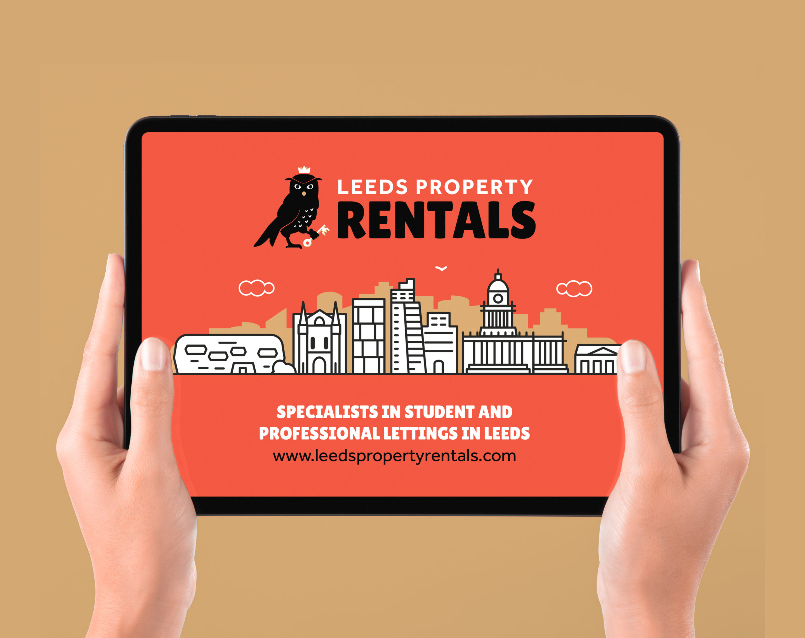
Leeds Property Rentals has been operating for over 40 years, but until recently relied on external agents to let their properties. As part of a wider company expansion, the business moved to renting properties directly, prompting a broader re-evaluation of the brand.
I was the lead designer on a multi-company branding programme spanning six related businesses. The aim was to create a brand style that feels fresh and accessible to both students and professionals, while also establishing a clear visual relationship across the group. This approach was used to strengthen brand recognition and improve visibility in a highly competitive market.
Market & User Research
Competitor Analysis
Market Research/Trends
Branding
Logo Design & Wordmark
Stationery
Marketing Collateral
Packaging Design
Exhibition Stand
Digital
UX & UI
Web Dev
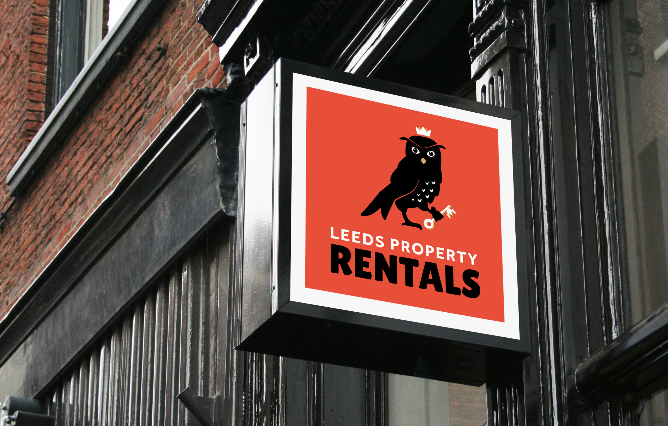
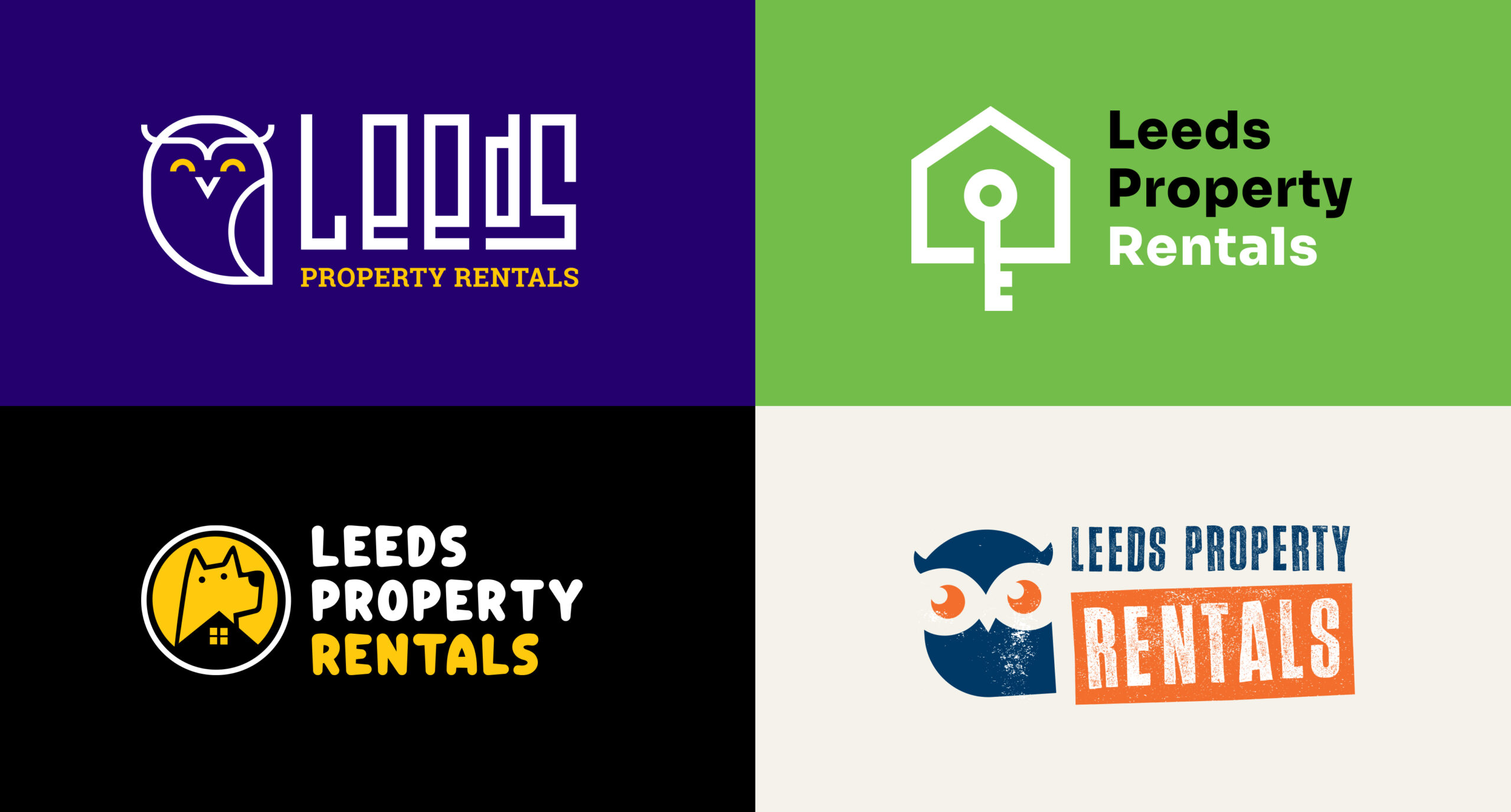
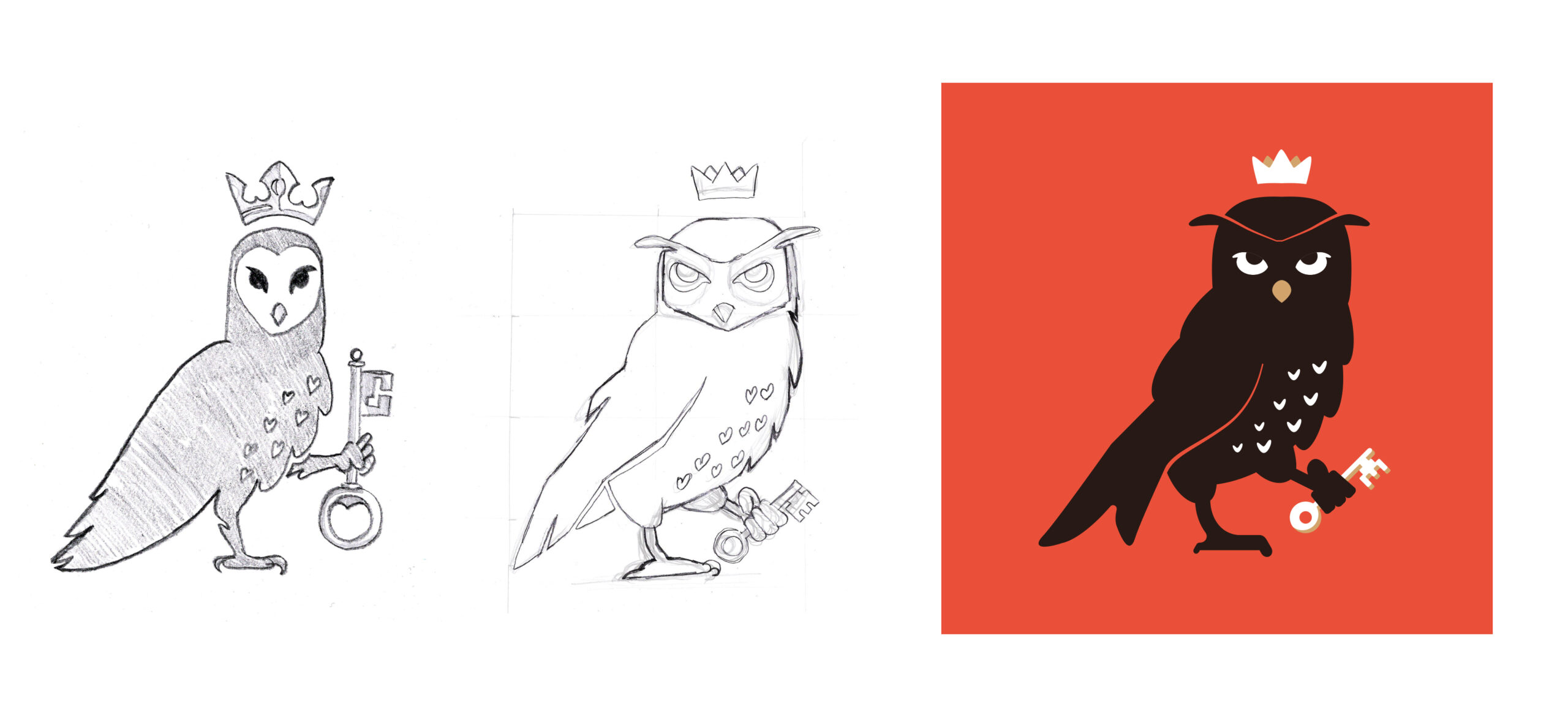
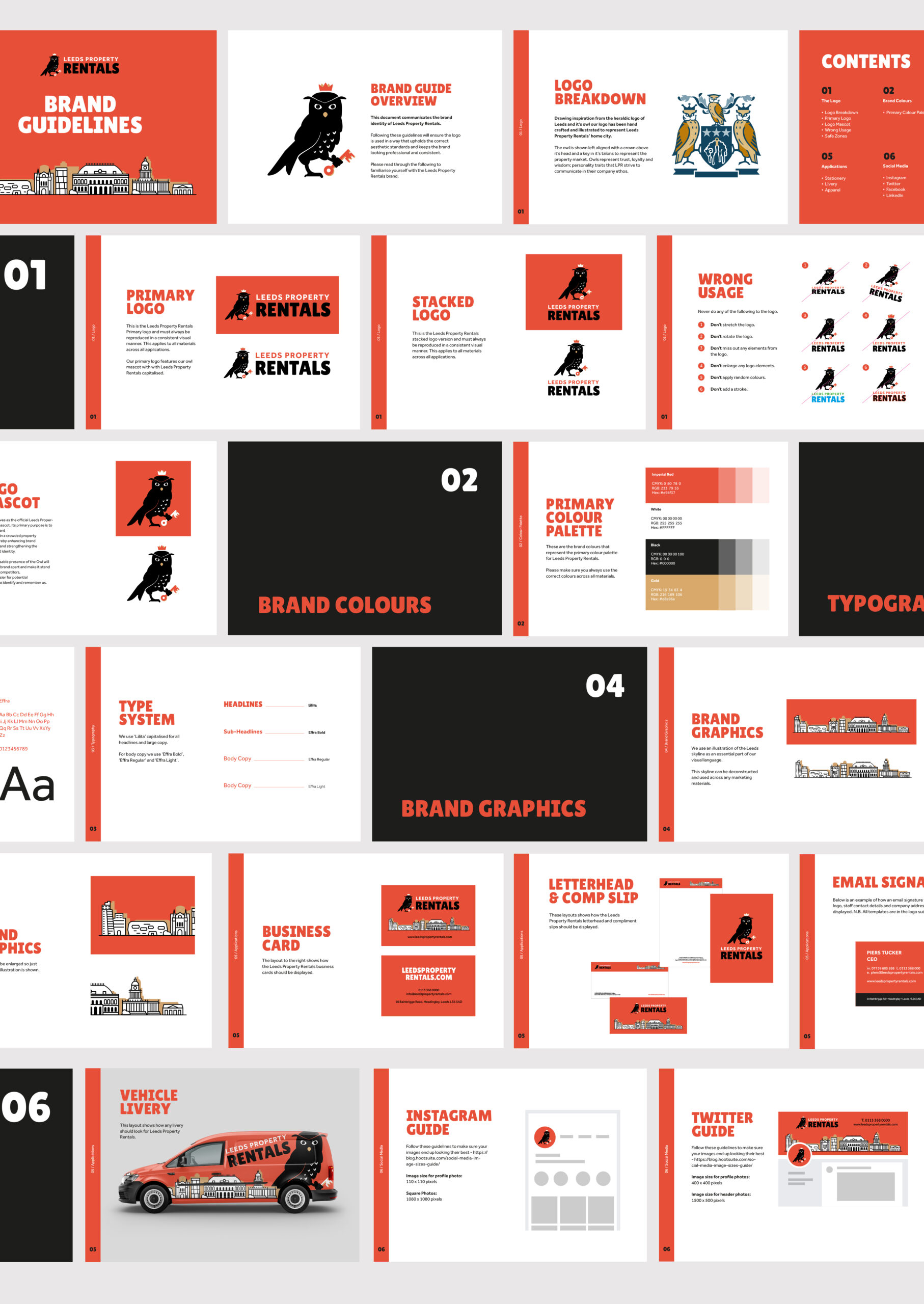
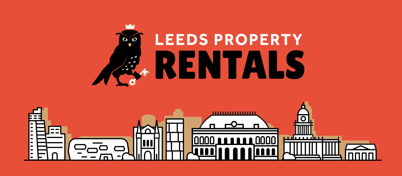
As proud locals, the owners were keen to emphasise their local credentials. after the first round of initial logos were submitted we delved a bit deeper and inspired by the Leeds city coat of arms, we eventually chose an owl as the centrepiece for each logo as it serves two functions.
Owls represent trust, loyalty, and wisdom—key attributes for any property company—and it also pays homage to the city of Leeds. The result was a fresh, hand-drawn look that incorporates these elements and resonates with both student renters and professionals.